Brief
Take a 550m2 space and make it into a branch that engages customers in new ways that embody the bank’s core value of ‘help is what we do.’
Waterfront Westpac branch design ebbs and flows with the tide
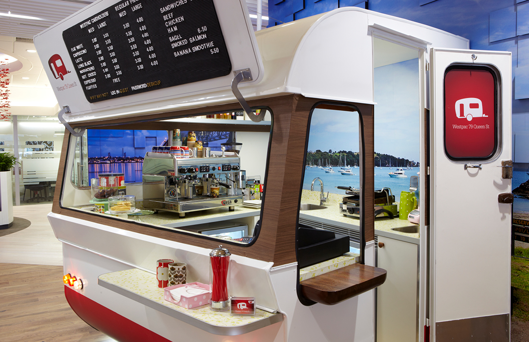
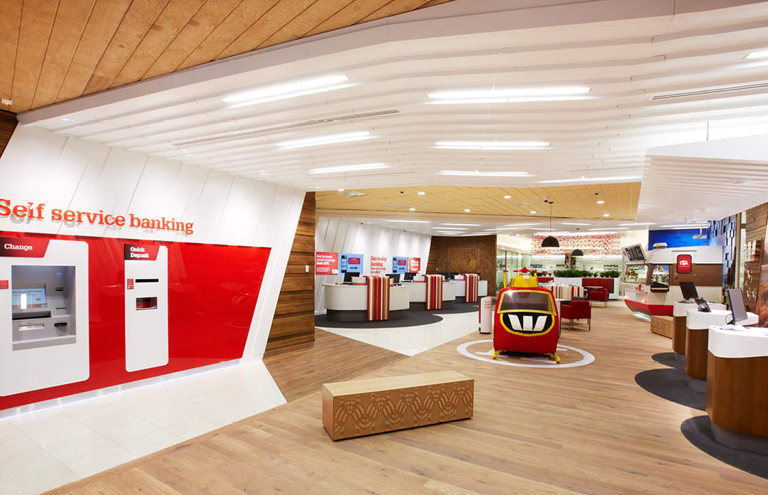
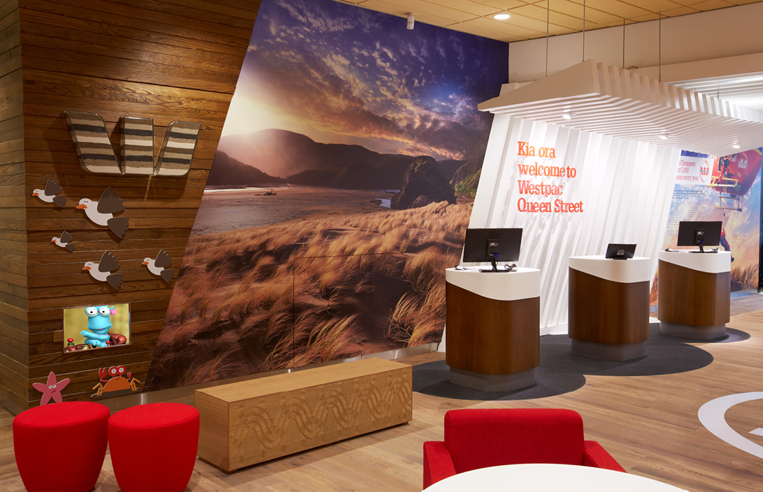
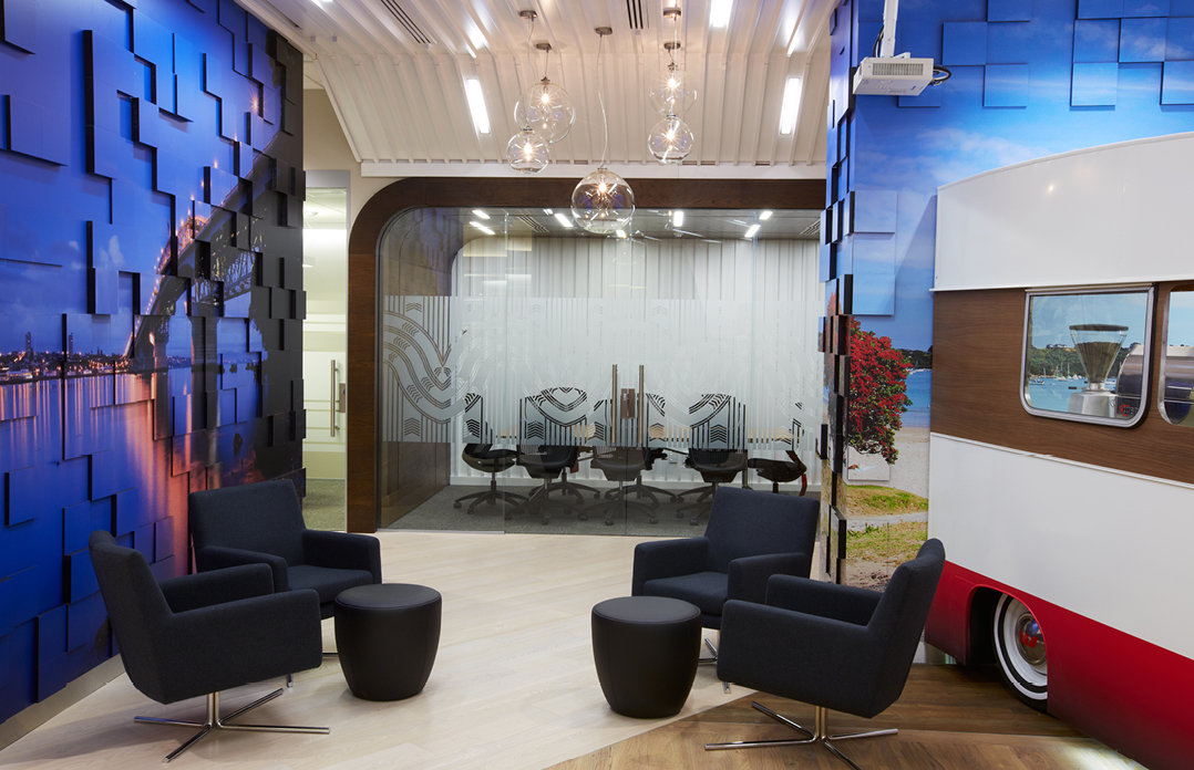
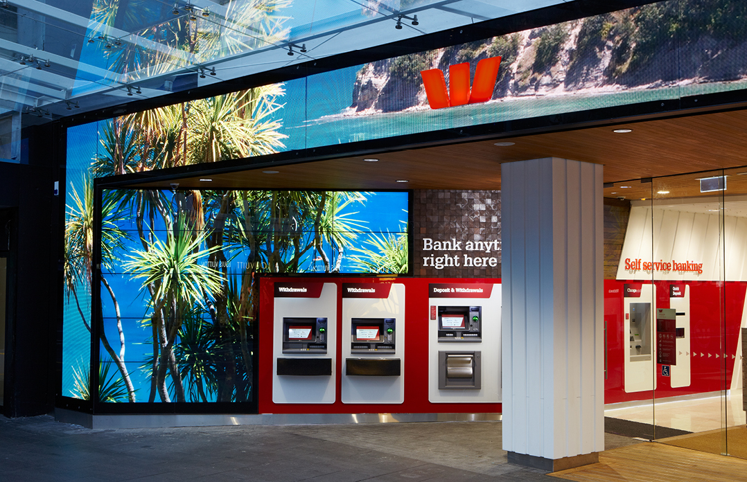
Westpac’s Queen Street branch sits on the threshold Auckland’s original foreshore, and the concept is driven from Kiwis intrinsic love of beaches and the waterfront. We wanted to explore the ever-changing ebb and flow of the water’s edge. By creating a unique space including a café caravan with a completely open façade, we were able to turn the location into an award-winning Westpac signature branch in Auckland – while turning banking convention on its head.
Customers cross the edge of the foreshore into the building and onto a wharf that leads through the branch, before arriving at a wave-inspired ceiling that wraps around the interior.
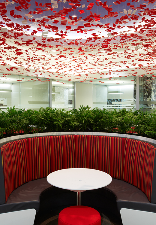
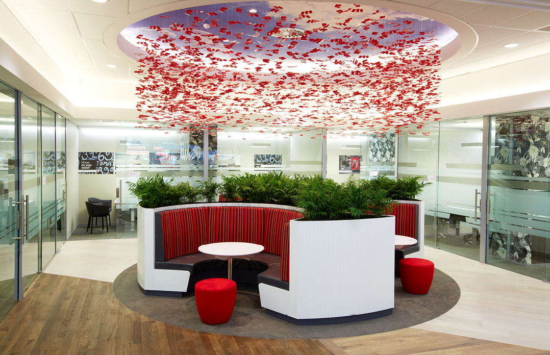
A flock of moving red birds (recreated as Westpac ‘W’s) fly under a blue-sky hovering over meeting spaces. Amid the birds are 208 white doves – each representing one of Westpac’s branches throughout New Zealand. The birds’ scene, like the other design elements, is eclectic and layered.
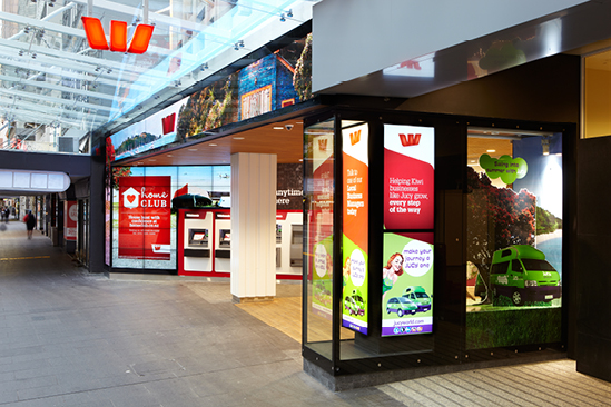
The fully open frontage, with air curtains for comfort, is innovative and inviting. 14 TV panels and 17m2 of LED screens create an attention-grabbing, ever-changing façade that draws customers in and can be integrated with every in-store device for unparalleled brand storytelling. It is more flexible and dynamic than any other frontage in the vicinity.
Services
Services